
Cursive Text Generator
Transform your text into elegant cursive and script styles instantly.
Start typing above to see font styles · ♡ to save favourites
Cursive Font Styles
♡ Favourites
What Is a Cursive Text Generator?
It is a free online tool that turns your regular text into elegant cursive fonts using special Unicode characters. You type a sentence, and within seconds you get handwriting fonts built from flowing letters that you simply copy and paste wherever you like, on Instagram, TikTok, or Facebook.
The appeal is that it works instantly. You’re not retyping words; you’re converting them into something beautiful, made of flowing connected letterforms that look like genuine handwritten script rather than stiff printed letters with continuous strokes.
How Cursive Fonts Work
The tool doesn’t actually convert your letters into a new font file. It swaps each letter for a lookalike symbol that already exists inside something called Mathematical Alphanumeric Symbols, a block originally built for mathematical equations.
Mathematicians needed a way to show italic mathematical characters and bold cursive letters in formulas, so engineers gave every letter its own weight and flow inside that block. Years later, someone realized those same shapes could double as elegant text for everyday use, and the cursive style generator was born.
Unicode Makes It Possible
None of this works without the Unicode Standard, the system that lets computers everywhere agree on how to display text consistently, worldwide, no matter where you are. It was built to handle text from every country on Earth, which is why a single standard can hold over 100,000 characters across nearly every language. Looking for something heavier and more medieval than flowing script? The Gothic Font Generator covers Blackletter and Old English styles built from that same Unicode toolkit.
Cursive Font Styles
This tool is part of our wider collection of style-based font generators that are all free, all copy-paste ready. Open any cursive font generator and you will see why people get a little obsessed with it. There are script fonts built for social media, TikTok bios, and quick copy-paste jobs into a profile, alongside softer calligraphy styles meant for captions, signatures, flowing letters, and comments.
Classic Script Style
This is the style I reach for when something needs to look genuinely refined. The letters stay flowing and timeless, closer to professional calligraphy than casual writing, with just enough flourish and sophistication to feel special without looking fussy. It is the natural pick for formal announcements, anything tied to wedding content, or upscale brand messaging that wants an expensive look without hiring a calligrapher.
Pair it with gold accents and a clean serif body text, drop it into minimalist layouts, and you get elegant handwriting that reads as premium the second someone glances at it.
Casual Handwriting
Not every message needs polish. Sometimes you want letters that feel relaxed, personal, and friendly, the kind you would expect on real handwritten notes rather than a printed page. This style shows up often on personal blogs, for friendly brand voices, and on casual event invitations where the goal is warmth, not formality.
It keeps decent readability while still showing personality, which is why small coffee shops and independent boutiques lean on it for menus and signs. It feels approachable, authentic, and genuinely down-to-earth, though it can read as unprofessional the moment you drop it into a formal document.
Bold Cursive Style
When a message has to win attention in a crowded space, this is the version to use. The strokes turn strong and visible, giving every word an impactful punch and a real authority of weight that holds up even inside busy designs. It is built for headers, important announcements, and anything that needs to be read clearly from a distance. That extra thickness is exactly why it shows up so often on logos and branding materials, including restaurant menu headers that want to feel handcrafted and artisanal. For pure bold styles without the cursive flow, check out our dedicated bold text generator.
Italic Flow
Slanted text feels dynamic, almost like it carries movement in the angle itself, like words in motion rather than letters sitting static on the page. It works well for quotes, book titles, and emphasizing phrases you want a reader’s eye to slow down on.
It suits poetic content and romantic messaging especially well, since the lean itself carries a bit of emotion, more felt than read, just from the form of the letters. For the full range of slanted Unicode styles, from Sans Serif Italic to Bold Italic Script, try our dedicated Italic Text Generator.
Decorative Flourish
This is the showpiece style, ornate and heavily detailed, full of fancy swoops and small embellishments that turn a plain sentence into one of the showstoppers on a page. You will see it most on high-end invitations and luxury brand messaging chasing maximum elegance.
It leans hard into decoration, which is exactly why perfume brands and jewelry companies love it, alongside upscale event invitations that want every loop of ornamentation to whisper premium quality before anyone even reads the words.
Simple Clean Style
Not every brand wants a flourish. This style keeps things minimal and clear, modern without any excessive decoration, just a soft connected flow between letters and clean lines that make for genuinely easy reading. Contemporary brands like it because it never feels old-fashioned, and I have seen plenty of tech companies and modern studios use it for exactly that reason.
It is one of the few styles that fits forward-thinking brands looking for simplicity and stays versatile enough to sit inside a traditional design or beside sharper modern design elements.
Bold Script Style
Bold script is my favorite style of cursive lettering to work with, mostly because the letters come out thicker and heavier than anything you’d get from traditional handwriting, yet the flowing, connected strokes still carry that pure cursive charm.
That added visual weight transforms even a single word like 𝓢𝓮𝓻𝓮𝓷𝓲𝓽𝔂 into something that feels looping, elegant, and alive, with letterforms that read as strong and deliberate on the page rather than too soft cursive or plain standard cursive, which can easily come across as delicate and wispy.
The quality that keeps me coming back to it is how it stays light enough to feel graceful while still carrying enough personality through its handwriting-inspired weight to instantly grab attention across a wide range of contexts, including Instagram bios, story highlights, business logos, brand wordmarks, wedding monograms, invitation headers, gaming usernames, streamer overlays, professional email signatures, luxury packaging, and personal social profiles, where that exact combination of warmth and confidence is what separates it from other font styles.
How to Use the Cursive Font Generator
Step 1: Enter Your Text
Start by typing into the input box at the top. It does not matter if you are pasting a line of quotes, drafting invitations, or testing social media bios for size, the tool handles all lengths just fine, from a short, meaningful word up to much longer text, before you even pick your favorite cursive style.
Step 2: Browse Cursive Styles
Once you hit enter, scroll through the results. Each one shows a live preview of your own text, not a generic sample, across hundreds of different cursive fonts. I usually narrow things down by what the text is for: a formal event points me toward classic script, while a casual brand pulls me toward looser handwriting styles. The sheer variety of font options on offer means you rarely settle for the first one you see.
Step 3: Copy Your Choice
Tap the copy button beside it and the styled text lands straight on your clipboard, usually with a small confirmation message flashing on screen so you know it worked. Mobile users can also tap and hold on the text instead, then select it and copy manually the regular way if that feels more natural.
Step 4: Paste Anywhere
Now drop it anywhere you like. Instagram, Facebook, your favorite design software, it all works the same way. Press Ctrl+V on Windows or Cmd+V on Mac, or just tap the paste option on your phone, and the styled text shows up exactly as it was previewed.
Cursive vs. Script vs. Calligraphy: Key Differences
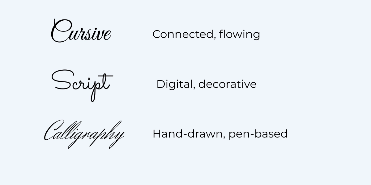
All three describe flowing, connected letters that mimic handwriting, so calling them related makes sense. But look closer and you will find slightly different styles hiding under one umbrella.
Cursive is really just joined flowing handwriting, the broader term for any script where letters connect instead of staying disconnected like print-style text. Script narrows that down to decorative lettering built for a screen or page. Calligraphy narrows it further still, into formal calligraphy, the kind made by hand with formal pen-drawn letterforms and real thick and thin stroke variations from an actual pen or brush, something Unicode font generators can only approximate using fixed character sets.
A good cursive generator or cursive fonts generator works as a kind of online converter that can blend styles across all three, offering variants of all three aesthetics in one place.
Connected vs Disconnected Letters
The clearest way to tell these styles apart comes down to one thing. Cursive uses flowing strokes that link letters together, while print fonts keep separate letters standing on their own. Connected letters carry more personality; disconnected ones carry cleaner form.
Readability Considerations
Readability is where cursive starts to struggle. At small sizes, flowing letters blur together fast, so it works far better for shorter passages than for longer text. Keep it as larger display text, and it shines; shrink it down to body text in articles or long documents. My rule of thumb is simple: cursive for headers, quotes, and emphasis; plain font for everything else.
When to Choose Cursive
Reach for cursive when elegance matters more than speed of reading, or when you want a personal touch that plain text just cannot give. It is rarely about maximum readability; it is about feeling. That makes it perfect for invitations, signatures, and other decorative text, anywhere its flowing nature fits a sense of celebration, romance, tradition, or pure artistic expression.
Popular Uses for Cursive Fonts
Most of the wedding content I have helped style starts here: invitations, save-the-dates, thank you cards, and the social media announcements that follow the big day. The look stays elegant with a romantic style and real sophistication, which is exactly why so much wedding-related content leans on it, from Instagram quotes to full wedding announcements.
Digital Signatures and Professional Use
If I had to pick the #1 use case I see in client work, it would be this one. A styled signature carries real authority and a personal touch that flat plain text cannot match, and it looks far better than clumsy clip art stuck at the bottom of an email. It works especially well in email signatures, where it almost reads as hand-signed.
Plenty of professional documents use the same trick: digital contracts, proposals, and certificates that want a sense of authenticity and a handwritten feel.
Instagram Bio Elegance
A bio gives you almost no space to work with, just a bit of tiny real estate to make yourself memorable. Elegant styling helps a lot here, especially paired with a strategic emoji or two and smart line breaks that add visual appeal without crowding the page.
Wedding Invitations and Personal Cards
Weddings call for a careful mix of formality and romance, and most wedding stationery is built around exactly that balance. Done right, it sets the perfect tone for guests before they even open the envelope. I have seen couples skip hiring a calligrapher entirely and get real cost savings by using a generator instead.
Restaurant Menus and Signage
Small food businesses use cursive constantly, and it makes sense. It signals homemade, artisanal, crafted-with-care food in a way that instantly humanizes brand messaging. Coffee shops, bakeries, and farm-to-table restaurants put it on menu section headers all the time, since elegant script adds ambiance to a room before a single dish even arrives.
You will see it again on specials boards, where it shapes the entire dining experience and signals genuine hospitality before a server says a word.
Personal Messages and Notes
A plain Happy Birthday text feels a little robotic compared to the same words styled into something warm. Cursive gives even short Thank You messages a clear visual hierarchy, drawing the eye to the right line first.
Brand Signatures and Creative Projects
Plenty of fashion brands and beauty companies build their whole identity around signature-style logos, the kind that look hand drawn by the founder. Creative professionals lean on the same trick for quick custom work when a client needs something polished fast, without commissioning a full logo from scratch.
Platform Compatibility and Device Support
One question I get constantly is if cursive Unicode fonts actually work on every phone. Mostly, yes. Across devices and platforms, including iOS, Android, Windows, and Mac, plus every major social media platforms, the cursive appearance stays the same, since it all rests on standardized Unicode script characters rather than an installed font file.
There is no font installation step at all. The only real risk is an old device showing boxes instead of letters, usually because it covers a different Unicode range than the one your device supports.
iPads and other iOS devices handle it fine without a separate iOS app, and the cursive styling stays intact the moment it lands. Android phones and tablets offer excellent Unicode support too, so cursive text displays correctly with no dedicated Android app, and no real issues to speak of.
Cursive Alphabet Examples (with Capital N, Capital M, Small K)
Capital M (ℳ 𝓜 𝔐)
When it comes to monogram design, the Capital M stands out as a popular pick and one of the strongest choices for making a single-letter monogram feel bold and complete. This letter looks elegant because of its three arches, which form a wave-like silhouette that gives the cursive strokes a deliberate, flowing rhythm. I have seen it used as an anchor letter on embroidered initials and on couple monograms, and every time the curves create a piece that is visually rich in its decorative styles.

Capital N (𝒩 𝓝 𝔑)
The Capital N often opens a name with confident motion, since its diagonal stroke dips and rises in a way that feels rhythmic rather than structured. People like Nathan or Nicole often choose this letter for wedding stationery or personal branding, because the monogram initial carries a strong presence on the page.

Lowercase k (𝓀 𝓴 𝔨)
The lowercase k is a modest letter on its own, yet in cursive it reads as something far more distinctive. Its tall stem and descending stroke form a loop-and-kick shape with a looping crossbar that gives the letter a lively, playful quality, and turning the strokes just slightly can sharpen the look even further. Designers often pick this letter for wordmarks, usernames, and brand names.

Free to Use and No Download Required
This is 100% free. No payment, no sign-up, no downloads, just generate unlimited cursive fonts and copy instantly, anywhere you need them, with no hidden fees attached. All tools on Font Generator Lab are completely free, with
no subscriptions, no usage limits, and full stop. To learn more about Font Generator Lab and the tools we build, visit our about page.
The old way required actual installation: you would install font files yourself, hunt down a font website, grab the right .TTF .OTF files, install font into your system, then restart applications before you could even select font from a menu on your own computers, when all you really wanted was a moment of instant cursive. Honestly, very few free fonts in cursive sites are worth that effort anymore.
Cursive Fonts in Microsoft Word
People often ask how this compares to Word’s own built-in fonts. Here’s the difference: Word’s cursive options are real fonts installed on your machine, while Unicode cursive is just text. There’s no need for installed typefaces at all when you use a cursive font generator, since it produces plain Unicode text rather than a true Word font. That one difference matters, because it means you do not need any special Word font selection menu, just generate text, copy, and paste, and it shows up already styled, displays correctly with zero installation on your computer.
A few document styling tips worth knowing for professional document formatting: it behaves consistently across platforms, so cursive fonts in word look the same across a Word document on Word for Windows, Mac, Online, or one of the mobile apps, all without touching font installation. It works fine across recent Word versions, basically anything from 2010 onwards.
Cursive Fonts on Canva
Open Canva, drop a text box onto your design, then generate, copy, and paste the Unicode text straight in, skipping the font menu entirely. It works across social templates, presentations, invitations, and marketing graphics, since Canva is built as a flexible design platform with plenty of its own design tools already on hand.
The whole step-by-step process gives you a styled result inside seconds, dropped right into your Canva design. Search cursive fonts canva and you will find people doing exactly this: pick a generator, get text generated, then bring it straight into Canva projects. There are a few small limitations, mostly around editing the pasted text later, but for everyday use it offers nearly full compatibility.
How Cursive Fonts Impact Social Media Engagement and SEO
Styled text really does increase engagement. I have seen numbers as high as 30-40% on certain social media posts, mostly because cursive feels more personal and authentic, encouraging users to actually interact with content instead of scrolling past it.
On the SEO side, keep your expectations realistic. Most platforms treat these links as nofollow links, so the real benefit is not rankings, it is attention. Eye-catching cursive earns more clicks, shares, and comments, and that extra visibility quietly works in your favor with platform algorithms, even without a direct ranking boost.
Troubleshooting: Cursive Text Showing as Boxes or Squares
If your styled text turns into little boxes or squares, do not panic. It almost always means a device’s system font does not include that specific Unicode code point. Different cursive style variants sit in different Unicode ranges, so the fix is usually simple: just switch style inside the generator and try a different one.
This is a device font coverage issue, not a broken tool. Most modern iPhones and Android phones running current software support nearly every range already, so boxes are rare these days, but if you do hit one, switching styles solves it almost every time. If switching styles still does not fix it, feel free to contact us and we will help.
Frequently Asked Questions
How Do Cursive Fonts Work Technically?
Cursive fonts here are built from Unicode mathematical alphanumeric symbols, a set of special characters that just happen to look like cursive handwriting. They are not images at all, just regular text carrying its own special formatting baked into each character, so what you are pasting is genuine text characters that simply look elegant.
Do Cursive Fonts Print Correctly?
Generally yes. Cursive fonts print fine on modern printers, since most current hardware reads Unicode characters the same way a screen does. Older hardware can be a different story: a handful of older printers run into small issues rendering certain ranges, though current printer models handle this text without trouble. I would still run a quick test print before relying on it for important projects.
Can I Edit Cursive Text After Pasting?
Yes, completely. Cursive fonts from this tool stay as editable text after pasting, not locked images. You can change spelling, add words, or delete sections the same way you would with any regular text.
Is my text stored or tracked?
No. We do not store, log, or share any text you type into this tool. See our Privacy Policy for full details.
Are Cursive Fonts Accessible for Screen Readers?
Not reliably, no. Screen readers can struggle with these cursive fonts, since some software reads the underlying Unicode characters oddly or skips them. For critical accessibility content, stick with regular fonts wrapped in proper HTML instead. Save the styled, decorative text for places where it is purely visual flair, never for essential information someone genuinely needs to hear read aloud.
Can I Use Cursive Fonts in Email Marketing?
Carefully, yes. Cursive fonts do not render the same across every email clients, and a few spam filters flag messages containing too many unusual characters. Always test your emails first, especially in subject lines. Keep the bulk of the message in plain text and save cursive for small accents, that way deliverability stays solid.
Are There Character Limits for Cursive Text?
The cursive font generator itself accepts unlimited input, so you can type as much as you want. The real limits come from destination platforms, each with its own limits: Instagram bios, for instance, cap out around 150 characters.
Can I Mix Cursive with Regular Fonts?
Definitely, and I would actually encourage it. Mixing cursive fonts with plain regular text usually creates the most effective contrast: cursive for headers and emphasis, plain font for the body text underneath. That combination keeps readability intact while still giving the page some elegance.